• Hello Guest! Did you know that ProjectKorra has an official Discord server? A lot of discussion about the official server, development process, and community discussion happens over there. Feel free to join now by clicking the link below.

    Join the Discord Server

Preview The New Website!

Mist

Staff member
Administrator
Hello everyone, if you recall, a few weeks ago I announced we were working on a new ProjectKorra Website. Today, I am prepared to announce that it is now available for preview.

You can preview the new website here: http://projectkorra.com/beta/

Keep in mind, this website is NOT complete, however, I am looking for feedback. It is expected to go live in the coming days.

You will be able to find the ProjectKorra (RPG) FAQ that we started a while back on there, completed.
 

Finn_Bueno_

Staff member
Plugin Developer
Verified Member
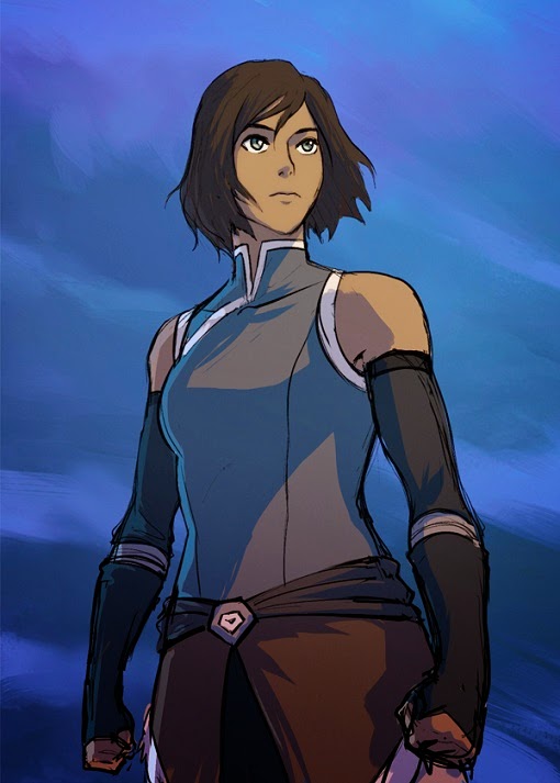
My first suggestion, change the waterbender on top of the page into an avatar minecraft character. Or even a whole group of benders and a chi blocker. It's not just about the water bending ;)
 

Joeri

Verified Member
My first suggestion, change the waterbender on top of the page into an avatar minecraft character. Or even a whole group of benders and a chi blocker. It's not just about the water bending ;)
I agree with this, atm the front page looks kinda empty, ik it's beta, just a suggestion though
 

SenpaiBlaze

Verified Member
Looks Nice. My suggestions are...
  1. Add an "online members" box
  2. Add a "recent threads" box
  3. Keep the same logo or make one of a bender representing each element and a chi blocker.
  4. Make an online staff box
  5. Make a staff page where each staff gets their own little bio and their profile picture. I will post my idea for a design here later.
  6. Keep the boxes on the home screen clean
  7. Don't have a forum board with the old look (probably just because its not in use yet, but still...)
  8. Make a search bar
  9. Don't forget to credit the staff, because (no offense) it looks like it was completely done by you. At least put "Made by Mistphizzle, The ProjectKorra Staff, and the Wonderful Community"
  10. Try to make a news feed besides the blue box
 

Mist

Staff member
Administrator
Looks Nice. My suggestions are...
  1. Add an "online members" box
  2. Add a "recent threads" box
  3. Keep the same logo or make one of a bender representing each element and a chi blocker.
  4. Make an online staff box
  5. Make a staff page where each staff gets their own little bio and their profile picture. I will post my idea for a design here later.
  6. Keep the boxes on the home screen clean
  7. Don't have a forum board with the old look (probably just because its not in use yet, but still...)
  8. Make a search bar
  9. Don't forget to credit the staff, because (no offense) it looks like it was completely done by you. At least put "Made by Mistphizzle, The ProjectKorra Staff, and the Wonderful Community"
  10. Try to make a news feed besides the blue box
Suggestions noted, but this is meant as a landing page, the online staff, etc, will all still be on the forum.
 

Ron

Verified Member
Uhm in the EULA tab, you wrote "You may direct your viewers / users to the ProjectKorra wbesite to install the plugins and addons." You need to fix the misspelling :p.
 

Moonelight

Verified Member
A cool new symbol on the top of the website would look nice.
AKA Korra in the avatar state with that flowwwwwyyy hair. c:

I bet @FearlessFrost could do something for you... I think I remember her saying something about Graphic designing?
 
Top