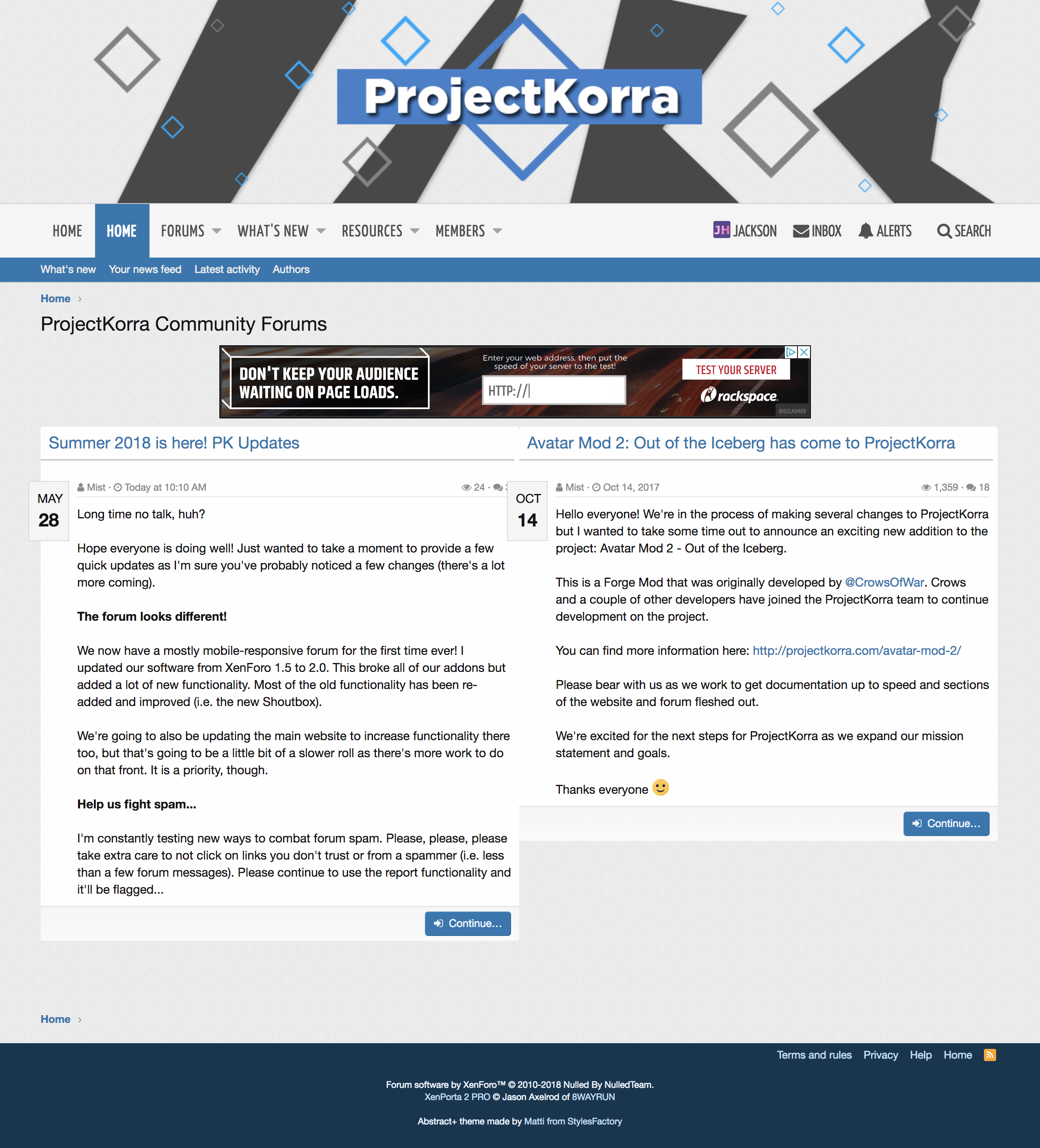
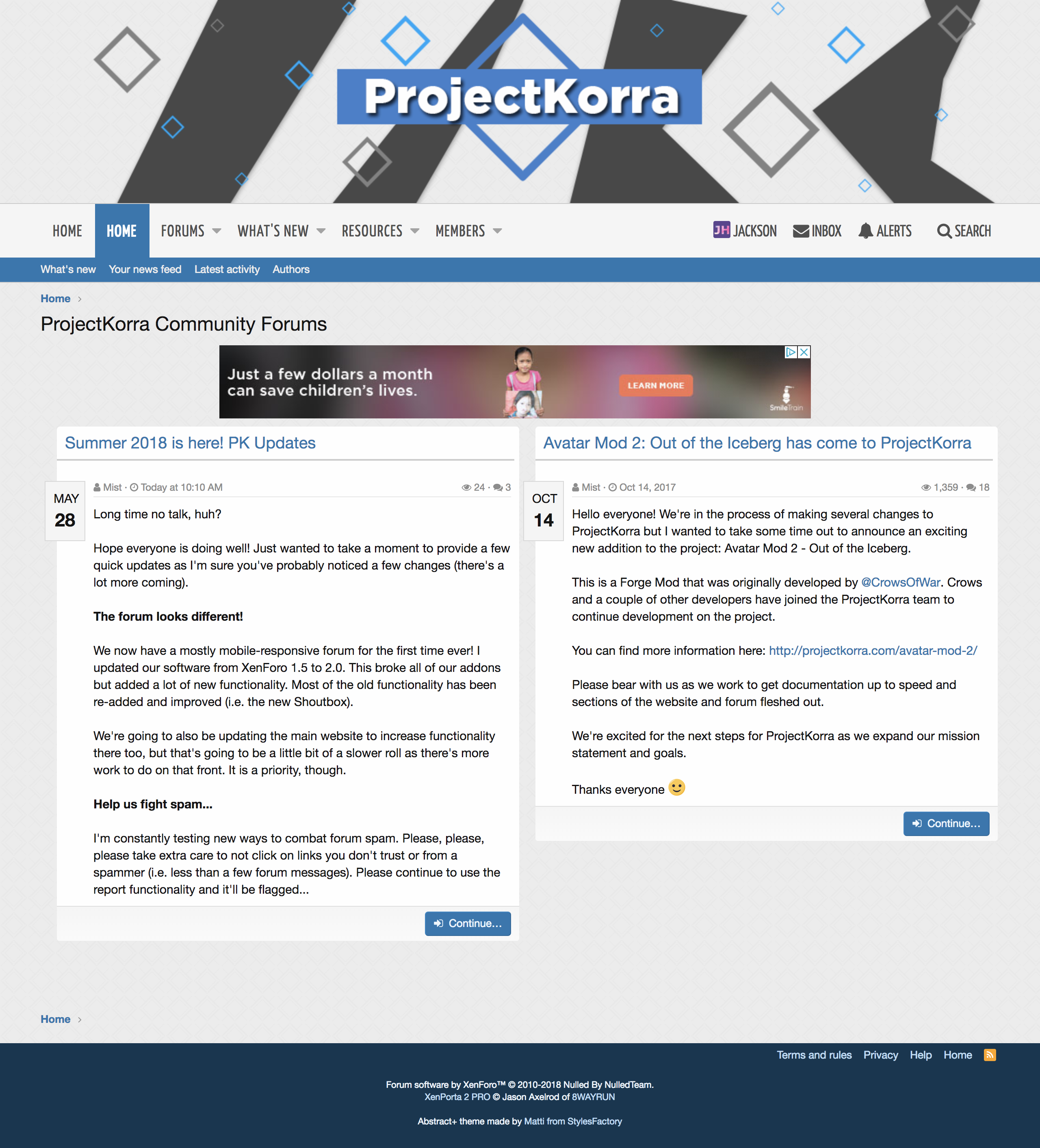
I have three suggestions!
-Jackson
EDIT: June 19th, 2018 (Edited the suggestions to add more)
- On the Announcements Page the two announcement articles are overlapping. If you add 'padding: 20px;' to the 'porta-article-item' class, it should fix this (it did for me).
- Could you change the second home page button (the XenPorta News Page) to News or Announcements so people are less confused?
- Also, on while I was trying to post this thread, I had to add the prefix "Pending Review" because it wouldn't let me post otherwise, could you also make that default?
- Apparently, there isn’t a scroll bar. This can be made in CSS so I don’t know if it’s intentional or not.
- The favicon is gone, and I miss the arrow. Could we have it back but this time blue?
-Jackson
EDIT: June 19th, 2018 (Edited the suggestions to add more)
Last edited:


