• Hello Guest! Did you know that ProjectKorra has an official Discord server? A lot of discussion about the official server, development process, and community discussion happens over there. Feel free to join now by clicking the link below.

    Join the Discord Server

Was bored, did my first animated bending thingy :D

What do you think?

  • Good!

  • Could need some work...

  • EEWWH WHATS THAT?! D;

  • Frickin' gr8 m8.

  • 10/9 - would bang - IGN


Results are only viewable after voting.

Froosty11

Verified Member
So, i got an idea when i was watching @Soarinsorin 's post, and thought i would try to! so this is my first animation so plz tell me what to improve... and which programs are better and stuff, here we go!
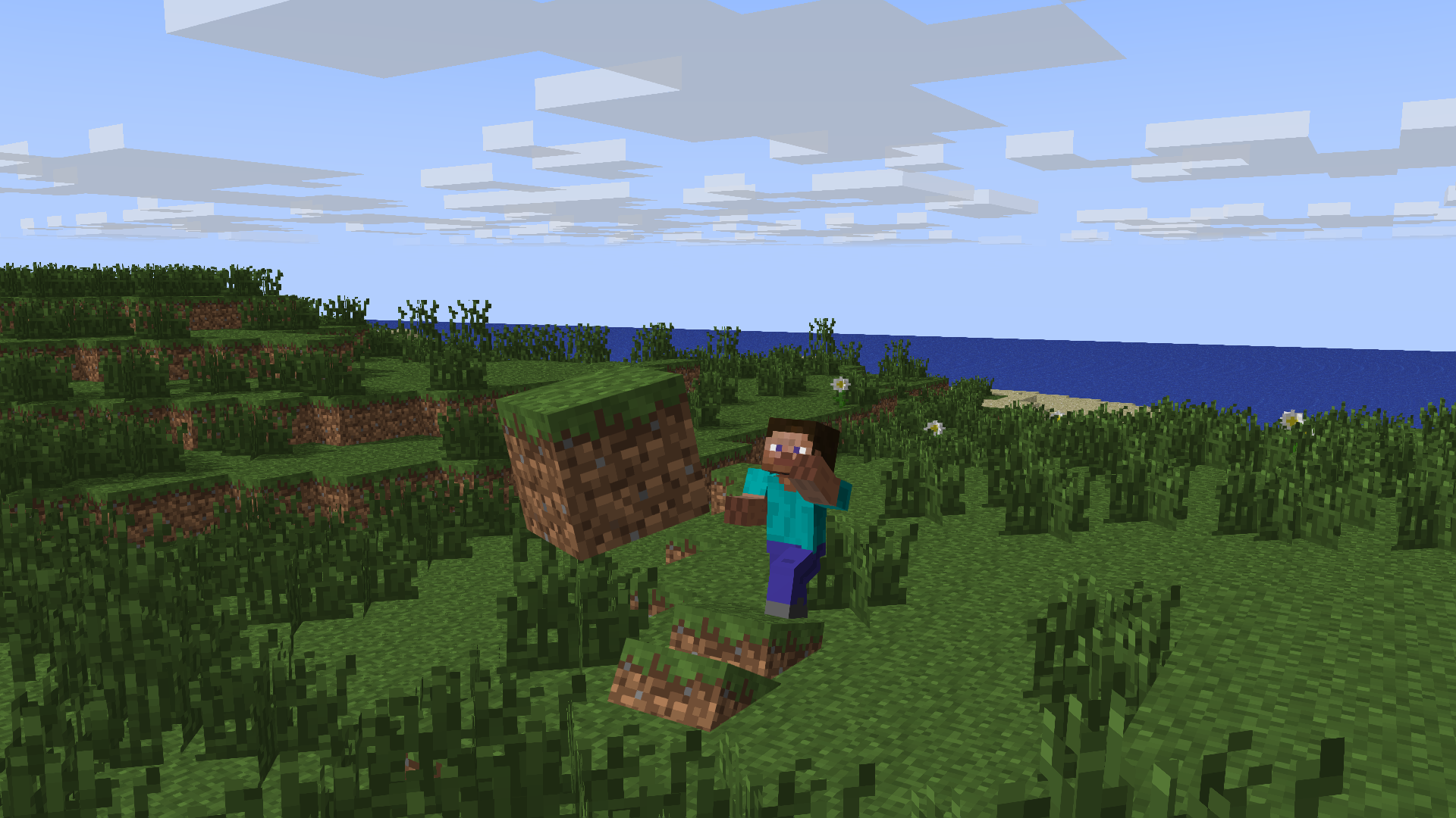
Animated Waterbending.png Animated Waterbending2 .png

Edit: Tell me what you want next down below, maybe ill make it? :D
 
Last edited:

HydroMan

Verified Member
No offense ,but from my perspective it looks terrible D: The only nice thing comes for me to say that congrats for your first animation (*grumbles silenty* even tho it looks "mehh" terrible for my eyes '_'), but good work.
 
Last edited:

Froosty11

Verified Member
No offense ,but from my perspective it looks terrible D: The only nice thing comes for me to say that congrats for your first animation (*grumbles silenty* even tho it looks "mehh" terrible for my eyes '_'), but good work.
ok...
 

HydroMan

Verified Member
Yeah i do. but what can i do to improve it, and what programs are good, cause im using some free shit
The first i dont like on how he smiles creppy. Other thing of the stances he is in. For the water you could have made it close to his hand(if you intented to attached it to his hand) as the hsnd looks apart from it. Icehand should be just one ice block covering the hand, then a "tower thingy". :)
 

Froosty11

Verified Member
The first i dont like on how he smiles creppy. Other thing of the stances he is in. For the water you could have made it close to his hand(if you intented to attached it to his hand) as the hsnd looks apart from it. Icehand should be just one ice block covering the hand, then a "tower thingy". :)
ok but thats my skin xD
 

Moonelight

Verified Member
No offense ,but from my perspective it looks terrible D: The only nice thing comes for me to say that congrats for your first animation (*grumbles silenty* even tho it looks "mehh" terrible for my eyes '_'), but good work.
:| You don't say that, unless you want him to hate you.

I personally think it is good.
 

Taiko the Waterbender

Verified Member
I like how the water looks :D 'Cause... You know... Minecraft '-' Were other people expecting water to not be blpcky? :3
The WaterManipulation is pretty nice. The WaterSpout could be bigger, covering completly the legs.
The IceGlove looks... Strange... Maybe a single block covering the whole hand?
The background isn't perfect, but I LOVE the Wbending *-* Good job!
 
Top